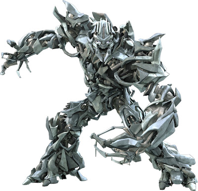
I just got my first good look at the designs for Michael Bay's "Transformers". What a mess! I'm sure he's got the best in the business, but man did something go wrong. All of them look so busy and void of any personality. The cars and ships they transform into convey more personality and emotion. Where is the eye supposed to look? You can tell that there's some Syd Mead in the designs, but even Syd Mead knew that you had to have a balance of simpilicy and complexity in a good design


7 comments:
I agree Kelsey! And on the trailer, when they move really fast, they look like a pile of jumbling metallic mosh. Where's Megatron's fusion cannon that we all loved? Wouldn't that weapon make more sense than those claws?
And WAY more fun!!!!
Don't bring up those Syd Mead Gundams-- talk about messing with a classic design. :(
aw come on Chris...
you sayin' Bay's designs aren't "classic"!
Hey Kelsey, you could not have said more than what I have thought about the designs. I completely agree with your points about simplicity. I feel the robot form design is the most noisy shit I have seen in a while. I feel the animators deserve credit because they made the transition from vehicle to fugbot looks rather amazing. I agree about the gundam thing, but Syd Mead made it the best he could and he thought it through from beginning to end....check out the Mead Gundam book. I aplogise for this random rant. But otherwise it's nice to let out my nerdom vents.
yeah I also thought so, Im glad to hear this from some very talented individuals. Now I know Im not alone on this.
Post a Comment